Skip to content

The mockup is the single most important checkpoint in the custom rubber duck production process. It is the moment where you see, for the first time, how your brand logo, colors, and design translate from a digital file onto a three-dimensional object. A careful mockup review catches problems while they cost nothing to fix. A careless approval sends 1,000 or more ducks into production with a flaw you will discover only when the bulk shipment arrives — at which point the only fix is a costly reprint or a full redo.
LZENGO delivers a digital mockup within 12 hours of receiving your artwork files. That 12-hour window is tight enough to keep your project moving but gives you time to review systematically. Before you click “approve,” run through these seven details. Each one is a common failure point that factories see repeatedly — and each one is free to fix at the mockup stage.
1. Pantone Color Match Against Your Brand Standard
The most frequent mockup error is also the most visible: the duck body color does not match your brand Pantone reference. On a screen, colors can look close enough. On the physical duck, the difference between Pantone 286C (a true navy) and a generic dark blue is immediately obvious to anyone who works with your brand daily.
When reviewing the mockup, compare the rendered duck color directly against your brand style guide. If you provided a Pantone code, the mockup should reference it explicitly. If the mockup shows a stock color labeled as “similar to your brand,” request a revision specifying that the body must be molded in your exact Pantone shade. The factory can mix custom resin colors — but only if you flag the mismatch at mockup stage. After production starts, changing the body color means starting over from material mixing, which halts the line.
For multi-color logos, check each printed color separately. The logo detail preservation guide explains that pad printing reproduces line work down to 0.3 mm, but only if the mockup specifies the correct ink Pantone for each color layer. A mockup that lumps “blue and red” without specifying which Pantone blue and which Pantone red will produce ambiguous results.
2. Logo Placement and Orientation on the Curved Surface
A rubber duck is not a flat sheet of paper. The curved surface means a logo that looks perfectly centered on a flat mockup file will wrap, stretch, or sit off-center on the actual duck body. The mockup should show the logo rendered on the three-dimensional duck form from multiple angles — front, side, and top — so you can verify the placement reads correctly from the viewing angle your customers will actually see.
Common placement issues include logos that wrap onto the underside of the duck, text that reads upside-down when the duck is viewed from a desk angle, and logos that sit too close to the wing joint where the surface curves sharply. The mockup should specify the exact placement zone — front chest, belly, top of head — and the orientation (horizontal, angled, centered). If the mockup does not show the logo from the viewing angle you care about, request additional mockup views before approving.
3. Printing Method Selection: Pad Print vs UV Print
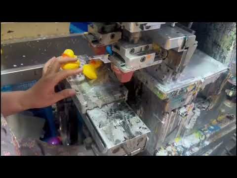
The mockup should clearly state which printing method will be used: pad printing or UV printing. The choice affects how your logo looks, how many colors are possible, and how the print holds up over time. If the mockup does not specify the method, you are approving a design without knowing how it will be produced.

Pad printing uses a silicone pad to transfer ink onto the curved surface. It is ideal for simple, high-contrast logos with one to three solid colors. It produces a slightly raised, tactile print that is durable and cost-effective. UV printing uses ultraviolet-cured ink applied directly, which handles photographic detail and gradients better but may not last as long on surfaces that receive frequent handling.
The pad printing vs UV printing comparison covers the trade-offs in detail, but at the mockup stage, the key question is: does the mockup show the print method that matches your design? A gradient logo shown in a UV print mockup but produced with pad printing will look fundamentally different. Confirm the method before approving.
4. Surface Finish: Matte vs Gloss
Surface finish changes how colors read and how the duck feels in hand. A gloss finish makes colors appear more saturated and vibrant, which works well for bold, playful brand identities. A matte finish softens the color and gives a premium, understated feel that suits corporate or luxury brands. The mockup should clearly indicate which finish will be applied.
The most common mockup mistake here is approving a gloss finish mockup when you intended matte, or vice versa. The color rendering differs significantly between the two — a navy blue duck in gloss will look brighter and more reflective than the same color in matte. Review the mockup finish against your brand guidelines. If your brand uses matte materials in its packaging and signage, a gloss duck will feel inconsistent. The matte vs gloss comparison provides reference images for both finishes.
5. Text Legibility at Actual Size
Logos that include text — a company name, a tagline, a URL — need to be legible at the actual duck size, not just on a large monitor. A mockup viewed at full screen on a 27-inch monitor makes everything readable. On a 3-inch rubber duck, the same text may be too small to read at arm’s length.
Before approving, check the mockup at actual size. Print the mockup image at the physical duck dimensions if you can. Text elements should be legible from 12 to 18 inches away — the distance at which someone viewing the duck on a desk would read it. If the text is too small, simplify the design: remove the tagline, shorten the URL, or increase the font size relative to the logo. The factory can advise on minimum legible text sizes for the duck’s surface area.
The artwork file requirements guide specifies that text in vector files should use a minimum stroke width and font size for production. If your artwork violates these guidelines, the mockup is where you will see the problem.
6. Alignment Between Front Print and Body Mold
If your duck has a custom-molded shape — a hat, an accessory, a unique body form — the printed logo must align with the molded features. A logo that overlaps the brim of a molded hat, or that sits at an angle that conflicts with the duck’s molded expression, creates a visually confusing result. The mockup should show the interaction between the printed elements and the molded body features clearly.
This detail matters most for custom-molded ducks rather than standard body shapes. For standard ducks, the printing surface is predictable and the alignment is straightforward. For custom shapes, the mold and the printing must be designed together — the mockup is your chance to verify that the two work in harmony. If the mockup shows the logo colliding with a molded feature, request a placement adjustment before production.
7. Packaging and Accessory Callouts
The mockup should not just show the duck — it should also confirm any packaging, hang tags, or insert cards that accompany the order. If your order includes individual polybag packaging, the mockup confirmation should note it. If you ordered a QR code on an insert card, the mockup package should show the card design. If you requested a retail box, the mockup should include the box artwork.
This is the most frequently overlooked detail because buyers focus on the duck itself and forget to verify the accessories. When the bulk shipment arrives with the wrong packaging — or no packaging — the problem traces back to a mockup that was approved without checking the accessory callouts. Review the complete mockup package: duck, print, finish, packaging, and any inserts. If something is missing from the mockup confirmation, request it before approving.
The Approval Checklist: What to Confirm Before You Say Yes
Before sending your approval, run through this quick checklist to make sure nothing was missed:
- Pantone color match confirmed against brand standard
- Logo placement verified from front, side, and top viewing angles
- Printing method (pad or UV) explicitly stated in the mockup
- Surface finish (matte or gloss) matches brand guidelines
- Text legible at actual duck size from 12 to 18 inches away
- Print alignment works with any custom-molded body features
- Packaging, hang tags, and insert cards confirmed in the mockup
Once all seven details check out, you can approve the mockup with confidence. The physical sample that follows — produced within 7 days of approval — gives you a final tactile check before bulk production begins. Between the mockup and the physical sample, these two checkpoints eliminate the vast majority of production errors.
Frequently Asked Questions
How long does it take to get a mockup after submitting artwork?
LZENGO delivers a digital mockup within 12 hours of receiving your artwork files. The mockup shows logo placement, color matching, printing method, and surface finish for your review and approval.
What happens if I find a problem in the mockup?
Request a revision. Revisions at the mockup stage are free and fast — the factory adjusts the digital mockup and resubmits, typically within another 12 hours. Never approve a mockup with a known issue, as fixing it during production is far more expensive.
Can I see the mockup on the actual duck shape I ordered?
Yes. The mockup should render your logo on the three-dimensional duck form, not just on a flat surface. If you ordered a custom-molded shape, the mockup must show the logo on that specific shape. Request additional viewing angles if the mockup does not show the placement clearly.
What file formats should my artwork be in for the mockup?
Vector files in AI, PDF, or EPS format at 300 DPI with Pantone color references. These formats allow the factory to scale and place your logo accurately on the duck surface without resolution loss.
What is the difference between the mockup and the physical sample?
The mockup is a digital rendering delivered within 12 hours. The physical sample is an actual production duck shipped to you within 7 days of mockup approval. Both checkpoints must pass before bulk production begins.
Get your free mockup in 12 hours.
Submit your artwork files and see exactly how your branded duck will look. Contact LZENGO to start.