A duck design is routed feature by feature, because a duck is not simply carved or printed; each mark on it is, and the marks do not share a job. The question to ask of every feature is whether it has to survive without ink, because that answer sorts a design into two lists faster than any discussion about tooling. Those two lists are what the rest of this page is about.
The choice between carving and printing is made feature by feature, not duck by duck.
In short: A carved detail is part of the cavity, so it is permanent, has profile and can be felt, and it cannot be changed without tool work. A printed detail sits on the surface, so it carries colour, fine text and anything that may change between runs, and it wears by abrasion. Most good duck designs use both: carve the shapes that have to survive, print the marks that have to change.

The Choice Is Made Feature by Feature, Not Per Duck
The question that starts this decision is usually the wrong size. Buyers ask whether a duck should be carved or printed, and the honest answer is that a duck is both, in proportions that depend on what is printed on it. A duck with a moulded feather wing, moulded eyes and a printed logo is not a compromise between two routes. It is a normal design.
The reason the per duck framing spreads is that artwork arrives as one file. A single illustration contains geometry, colour and text, and it is easy to treat it as one decision. The factory cannot. Its cavity carries shape, and its print station carries ink, and the two are specified, sampled and checked separately.
So the first pass on any artwork is a sort. Take every mark, every line and every block of colour, and put it in one of two columns: things that must still be there when the ink is gone, and things that exist because of ink. Most designs split cleanly once the question is asked that way.
What makes the sort worth doing early is that the two columns have different failure modes, different revision paths and different evidence on the sample. A soft carved line is a tool problem. A lifted print is an adhesion problem. Mixing the two in one conversation is what turns a sample review into an argument.
What Carving Gives You: Permanence, Profile and Touch
Carving puts the feature into the cavity, which means the shape is born with the part. Nothing can rub it off, nothing can fade it, and no wash can take it away. That is why the details that identify the duck, the eyes, the wing, the beak line, the texture on the tail, are normally carved.
Carving also buys profile. A carved line has a wall and a floor, so it catches light and casts a small shadow, and that shadow is what makes a duck read as a duck from a few feet away. A printed line of the same width is flat, and flat detail disappears in a photograph and under a shop light.
The trade in carving is measured in flexibility rather than in ink. A carved feature is fixed once the cavity exists, so a change means tool work and a new sample, and a detail that is slightly too shallow on the first shot is a tool correction rather than an artwork edit. That is why the features that go into the cavity should be the ones the design cannot live without.
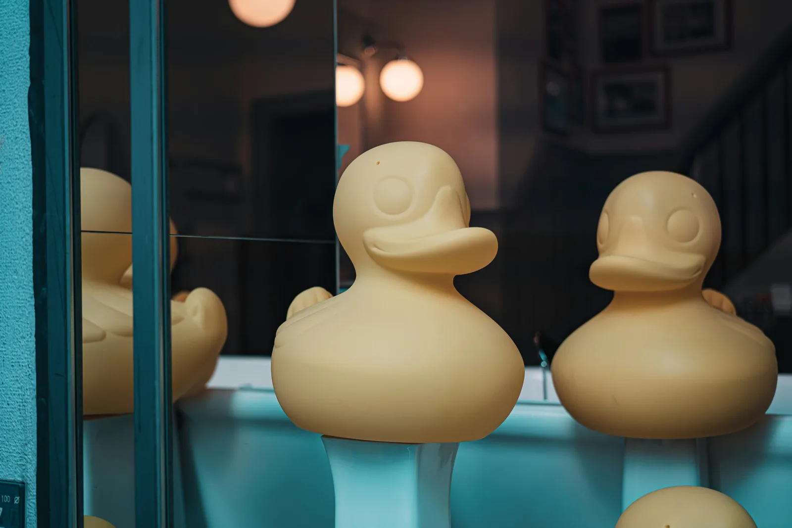
A Carved Detail Has a Direction
A moulded mark is either a hill or a hollow, and the choice changes what the drawing has to describe. On a raised mark the cavity carries a hollow, so the steel has a pocket where the mark will stand proud. On an inset mark the cavity carries a hill, so the steel has a boss that presses into the part.
Each direction asks something different of the drawing. A raised mark needs draft on its walls so the part releases, and its edges need a radius, because a sharp crest is a hard edge to fill and an easy edge to damage. An inset mark needs a floor that the material can reach, and a wall thin enough to fill without a short shot.
Placement matters as much as direction. A mark that crosses the parting line will be cut in half by it, and a mark on a thin wall will distort the shape it sits on. The practical rule is to keep a carved mark in the middle of a surface, away from the seam and away from the thinnest section.
Wear separates the two directions over time. A raised mark takes the handling first, so its crest polishes and its definition softens. An inset mark keeps its edges longer, but the hollow collects paint, dust or polish and starts to read as a filled line. Neither is a defect at the start of a run and both are visible at the end of one.
What Printing Gives You: Colour, Fine Text and Change
Printing does the things a cavity cannot. It puts a second colour on a single body without a second material, it holds fine text at a size a cavity would struggle to fill, and it can be changed between runs without touching the tool. A year, a batch code, a campaign line, a sponsor mark: those belong to ink.
The trade is that print lives on the surface, so it depends on that surface. Ink adhesion is a property of the pair, the ink and the body, and it is affected by how clean the body was, how the surface was prepared and how the print was cured. A dark colour on a glossy body can look perfect on the day it was printed and lift at the edge after handling.
Fine text is where print earns its place and where the sample review has to be honest. A small block of type can be legible on a flat proof and marginal on a curved body, and registration on a curve drifts at the edges of the print area. The UV and pad printing page covers how the two methods behave, and the Pantone page covers how a colour target is set before the print runs.

Where the Two Meet: Carve the Body, Print the Variable
The designs that hold up are the ones where the two routes are assigned by lifetime. Carve the geometry that defines the duck and stays true for every unit: the eyes, the wing, the beak, the textural lines. Print the marks that differ between buyers, seasons or batches: the logo, the colour block, the year, the code.
That split produces a useful test at the sample stage. If the print is removed, the duck should still be recognisable as that duck. If it is not, the tool is carrying too little and the print is doing the identity work, which is the arrangement most likely to fail on the second delivery.
It also changes how a revision is handled. A change to a printed mark is an artwork change and a new proof. A change to a carved mark is a tool change and a new sample, and the two are not traded against each other. The logo placement page covers where a printed or carved mark can sit before the shape starts to distort.
| Feature | Belongs in | Why there | What the sample has to show |
|---|---|---|---|
| Eyes, beak line, wing relief | Carved | Identity and profile, and they must survive without ink | A clean crest and a readable shadow in raking light |
| Feather or tail texture | Carved | Detail that has to catch light across the whole run | Even depth across the surface, no short shot at the edge |
| Logo block | Either, decided by colour | Carved if it must never be lost, printed if it needs a second colour | A crest that fills cleanly, or a print with a closed edge |
| Year, batch or campaign line | Printed | It changes, so it cannot live in the tool | Legible type on the curve, and registration inside the print area |
| Fine type and small symbols | Printed | A cavity cannot hold the fine detail reliably | Type still readable at arm's length, not only under a lens |
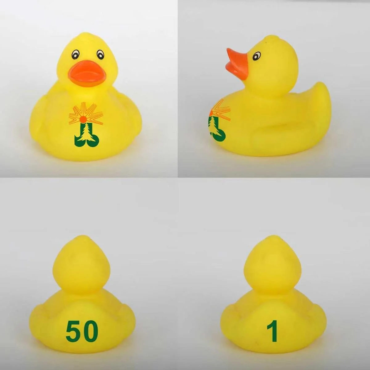
The Four Questions That Decide a Feature
The sort is faster with four questions asked of each mark, and they work on any design. The first is about identity: which features would still be recognisable if every printed mark were removed. Everything in that answer belongs in the cavity.
The second is about change: which printed marks will change within a year, and which ones are permanent. Anything that will change belongs to ink, because a tool change to fix a printed mark is the most expensive way to solve a design problem.
The third is about resolution: if a carved detail comes out soft on the first sample, is the fix a heavier line or a printed mark. A detail that is already at the limit of what the cavity can hold will not improve with a second attempt, and the honest answer is often to move it to print.
The fourth is about evidence: which route will the test file have to describe, the coating or the substrate. That question matters more than it looks, and it has its own section below.
- Which features would still be recognisable if every printed mark were removed?
- Which printed marks will change within a year, and which ones are permanent?
- If a carved detail comes out soft on the first sample, is the fix a heavier line or a printed mark?
- Which route will the test file have to describe, the coating or the substrate?
The Safety File Changes With the Route
Carved geometry and printed ink are tested differently because they are different things. A carved detail is material, so it is assessed as a shape: an edge, a point, a projection. A printed detail is a coating, so it is assessed as a coating: what is in it and how much of it a child can reach.
The shape side has its own vocabulary. The U.S. Consumer Product Safety Commission explains that ASTM F963 is the mandatory toy standard under 16 CFR part 1250, and that its accessible edge and point sections apply before and after use and abuse testing. A raised carved ridge that looks decorative on a drawing is a candidate for that review once it is on a part.
Accessible edges (includes threading on bolts/rods) must be free of burrs and feathering.
That line comes from the CPSC guidance on the same section. The regulatory definition behind it sits in 16 CFR 1500.49, which treats a hazardous edge as a geometric condition rather than a surface finish. Read the CPSC toy safety guidance before deciding that a decorative crest is small enough to ignore.
The coating side is a materials question. A printed mark adds a layer that the substrate assessment does not necessarily cover, so the report has to name it. When the same mark is carved, there is no added layer and the question disappears.
How to Check the Split on the Sample
The sample is where the routing is proved, and it is proved by looking at the carved detail and the print separately rather than by judging the duck as a whole. Start with raking light across the carved area, because a light held at an angle shows depth and a light held straight on hides it.
Then check the print at its weakest point. That is usually the edge of the print area, the inside of a fine letter, or the place where the print crosses a curved surface. A rub with a thumb and a look at the edge under a bright light tells you more than a photo of the mark in the middle.
Finally, compare two units. One duck shows what the process can do. Two ducks show whether it does it the same way twice, which is the only question that matters for a run. The sample approval page covers the wider evidence set, and the facial detail page covers the parts of the face where carving and safety meet.

Frequently Asked Questions
Can a carved detail be added to an existing mold?
Sometimes, if the cavity has material to give and the change is a shallow addition inside an existing surface. A deeper change, a new edge or a mark that has to move position usually means cutting the cavity again or welding and re-cutting it, which is a tool decision rather than an artwork update.
Is a print always less durable than carving?
No. A well adhered print on a suitable surface can outlast a poorly formed carved line, because a soft carved line wears at its crest. What print cannot do is survive without ink, so the comparison should be about the job the feature does rather than about which route is generally tougher.
Which route is better for small text?
Print, in most cases. A cavity can hold small type, but filling it cleanly depends on the material reaching the detail, and a letter that fills short reads as a smudge. Print holds small type better and can be re-run without tool work, which is why codes and legal lines usually go to ink.
Does the choice change the safety file?
It can. A carved feature is assessed as shape, so edges and points are part of the review. A printed feature is assessed as a coating, so what the ink contains and how much a child can reach become part of the review. The same mark can sit in either file, but the file has to say which one it is in.
Final Note: Five Checks Before the Tool Is Cut
- Sort the artwork feature by feature, and name which marks must survive without ink.
- Decide the direction of every carved mark, raised or inset, and draw the draft on it.
- Keep carved marks away from the parting line and away from the thinnest wall.
- Send the fine type, the variable marks and every second colour to print, and set the zones.
- Check the sample twice: raking light on the carved detail, thumb and bright light on the print edge.
The split is not a technicality. It decides what a buyer can change later without a tool, and what a factory can promise without a revision. A design that knows which of its marks are permanent is a design that survives its second delivery.
Key takeaways
- The route is decided mark by mark, because a duck is normally both carved and printed, covered under the choice is made feature by feature.
- Carving buys permanence, profile and a shadow that a flat print cannot produce, covered under what carving gives you.
- A carved mark is a hill or a hollow, and each direction asks something different of the drawing and of the sample, covered under a carved detail has a direction.
- Print carries colour, fine text and anything that will change, so variable marks belong in ink, covered under where the two meet.
- The safety file follows the route, because shape and coating are assessed as different things, covered under the safety file changes.