The page a brand book is missing until a three dimensional object arrives.
Reading a brand book against a duck rather than a screen exposes the three things the book usually leaves out. Such a book is thorough about paper, pixels and the flat lockup, and silent on what a moulded body changes: the shape of the mark, the space around it and the material the colour sits in.
The short answer: A brand book needs one page written for a three dimensional object. It should fix which mark variant goes on a duck, how clear space is measured on a curved body, which colour reference is approved for moulded material rather than ink, which marks the duck must carry that the book never mentions, and who may sign an exception. Without that page, every duck order becomes a new brand decision.
What the book controls and what the duck overrides
The brand book controls the mark, the palette and the tone. The duck overrides the geometry. A flat logo is read at one size on one plane; a duck is read from the front, the top, the side and the base, and each surface offers a different width, a different curve and a different amount of stretch.
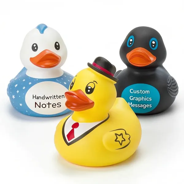
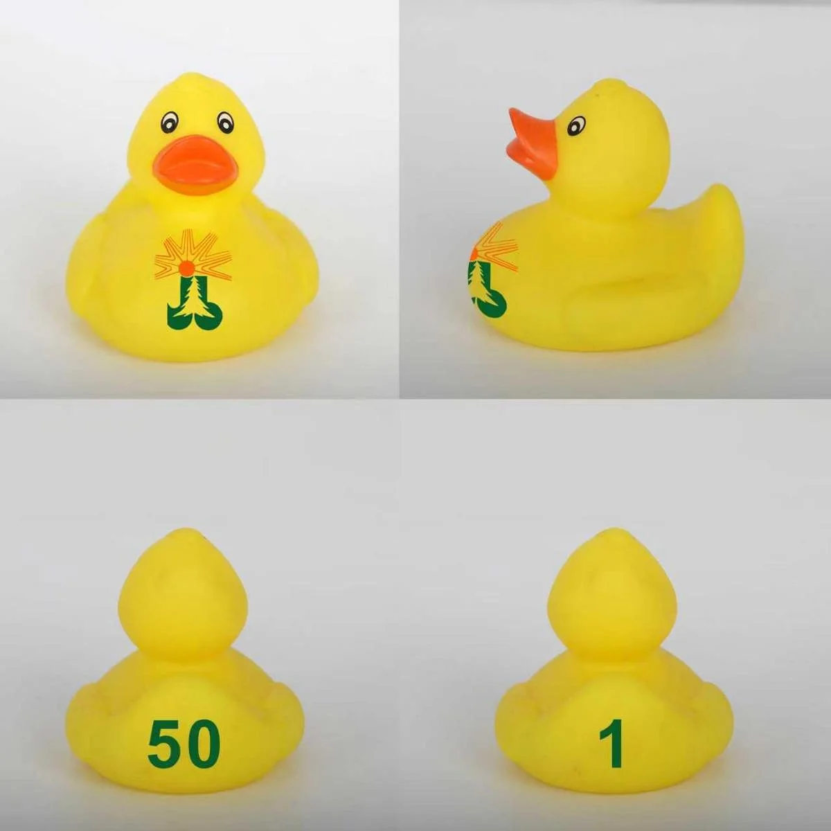
That is why a logo that is perfect on a business card can look wrong on a chest. The chest curves away at both ends, so a wide lockup loses its outer letters or wraps around the body. The top of the head is smaller than it looks in a photograph and is often taken by a moulded accessory. The base is the only reliably flat surface, and it is the one the book never discusses.
The page in the brand book should say which of those surfaces is approved for which mark, and it should say it in the same language the book already uses. A brand team that has already decided a minimum size for print can decide a minimum width for a duck in the same meeting.
The mark variant the book does not have
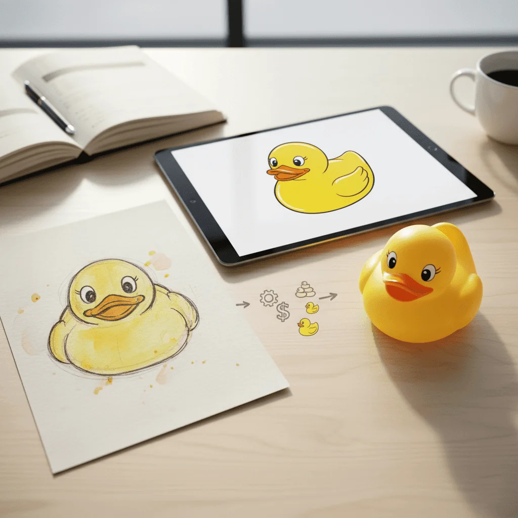
Most books carry a primary lockup, a stacked lockup and a mark on its own. A duck usually needs a fourth: the mark reduced to the few shapes that survive a one inch print on a curved surface. That variant is not a smaller copy of the primary. It is a redrawing with the strapline removed, the fine lines thickened and the counter shapes opened.
The decision belongs to the brand team, not to the factory. If the book does not name the variant, the printer will make the reduction at the plate stage, and the result will be a logo that is technically the mark and recognisably weaker. The page should show the variant beside the primary and state the smallest surface where each one may be used.
| Surface | What the book usually gives | What the duck page has to add |
|---|---|---|
| Chest | The primary lockup | The reduced variant and its widest allowed size |
| Top of head | Nothing | Whether the mark may run beside a moulded accessory |
| Side | The stacked lockup | The short version that survives the curve |
| Base | Nothing | The record marks that belong there |
Once the table exists, the artwork conversation becomes a lookup. The placement guide covers which surface suits which mark; the brand book only has to approve the choice.
Clear space is measured in duck, not in millimetres
A brand book usually defines clear space as a multiple of a letter or a fixed distance. Both work on paper. Neither survives the trip to a duck, because the duck has no straight edge to measure from and no flat margin to protect.
The workable rule is relative: clear space is a fraction of the mark width, measured from the mark to the nearest edge of the printable zone. That definition travels to every surface without a conversion table, and it lets the printer check the file without asking the brand team a question.
The rule also has to name the exceptions. A mark beside a moulded hat, a beak or a wing has a physical neighbour, and the clear space may have to shrink to keep the mark on the body at all. The page should say which neighbours are allowed to enter the zone and which are not.

The colour clause: the book gives inks, the duck takes compound
A brand book names ink systems, and an ink reference assumes a substrate the book can control. A duck is not that substrate. The body colour comes from the compound, and a printed mark sits on top of a glossy, flexible surface that changes how the same ink reads.
The page should therefore carry two references, not one: the approved body colour in the material system and the approved print colour with its tolerance. The body reference decides what the duck is made of; the print reference decides what the mark looks like on it. A single Pantone number cannot do both jobs, and treating it as if it can is how a brand colour arrives warmer or greyer than the chip.
The colour matching notes explain how the chip is chosen and kept. The brand page should name the person who holds the physical chip, because a reference without a keeper drifts with every batch.
The marks the book does not mention
A duck sold as a children's toy carries marks that no brand book anticipates: an age grade, a warning where the age grade requires one, a producer mark and a tracking mark. None of them is a brand asset, and all of them compete for the same surfaces as the logo.
The page should reserve space for them before the artwork is drawn, not after. A chest that is fully committed to a logo has nowhere to put a warning, and a base that is used for decoration has no room for the tracking mark. The toy safety label guide sets out what has to appear; the brand page decides where it is allowed to appear.
For a duck sold as a children's toy, the CPSC toy safety guidance explains that section 106 of the CPSIA made ASTM F963 a mandatory consumer product safety standard, which is why the label text is part of the product definition rather than a sticker added at packing. The small-parts scope at 16 CFR 1501.2 covers toys intended for children under three years and names bathtub, wading pool and sand toys, so a duck aimed at that age has to settle the small parts question before the mark is drawn.

Who signs the exception
Every brand system has exceptions, and a duck order generates more than most. The mark may have to shrink, the clear space may have to give way, the colour may have to move to the material system. The book should say who can approve each exception in writing, and what an approval covers.
The dangerous answer is that anyone on the brand team can approve a file. The workable answer is one named signer for artwork changes and one for colour, with a note in the file that records the date and the version. When the approved duck arrives, the signature is what makes the comparison a check rather than an opinion.
The exception should also expire. A one-off approval for a campaign should not become the default for the next series, and the page should say that a new series needs a new approval even when the mark looks the same on the screen.
The photograph the brand team will judge
The brand team will judge the duck from a photograph, and the photograph will not be the surface the buyer sees. It will be a three quarter view on a white background, lit to show the print, and it will make a mark look larger and flatter than it is on the body.
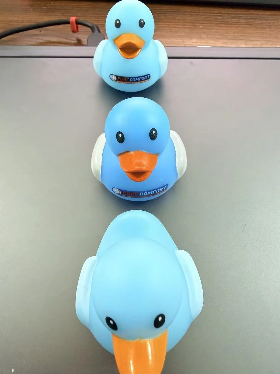
The page should name the photograph that counts. Ideally that is a physical duck kept beside the approved file, with a second photograph taken from the front, the top and the base under the same light. A brand team that approves only the hero angle will be surprised by the side view, and the surprise will arrive after the tool is cut.
The mockup approval checklist and the sample approval notes cover the record. The brand page only has to say which view is authoritative.
What the page has to say to survive the second run
A brand page is tested by the second run, not the first. The first run has the brand team's attention; the second has a new project manager, a new file name and a printer who was not in the room. The page survives if it answers the next person's question without a meeting.
That means naming the file, the variant, the colour reference, the surfaces and the signer, and stating which of them carry forward unchanged. It also means stating the standard the product is retained against, because the mark is only part of what a reorder has to reproduce.
The page is short by design. One page is easier to attach to a brief than ten, and a page that is read is worth more than a chapter that is skipped.
Five questions before the artwork
A brand team can answer these in one sitting, and each answer removes a question that would otherwise come back at the plate stage.
- Which mark variant is approved for a one inch print on the chest?
- How is clear space measured on a curved surface, and which neighbour may enter it?
- Which body colour and which print colour are approved, and who holds the chips?
- Where do the age grade, warning and tracking marks sit on this duck?
- Who signs an artwork or colour exception, and when does that approval expire?
Frequently Asked Questions
Does a branded duck need a separate brand guideline?
It needs one page added to the existing guideline, not a separate document. The page covers the three things a flat brand book cannot answer: the reduced mark variant, the clear space rule on a curved surface and the colour reference in moulded material. Keep it inside the book so it travels with the brand.
Can the logo simply be scaled down to fit the duck?
Not below the point where its fine lines and counters survive the print. A scaled down primary lockup loses the strapline and fills in the small gaps. The page should show a redrawn variant for small surfaces and state the smallest width at which each version may be used.
What does the brand team need to send with the artwork?
The approved variant, the colour references for body and print, the placement drawing and a written note of who may approve changes. A vector file alone is not a brand approval, because it does not say which version of the mark is authorised or where it may sit.
Who is responsible if the mark on the duck differs from the book?
The difference is a discussion about which document was approved, so the page should settle it in advance. Name the signer, keep the approved duck and record the file version. When those three exist, the comparison is factual and the responsibility follows the signature.
Final Note
A brand book is a promise about how a brand looks. A duck is a test of whether that promise was written for objects. The one page is not bureaucracy; it is the difference between a mark that is applied and a mark that is interpreted.
That page belongs in the book before the first duck order and gets revised after the first delivery, when photographs show what the surfaces actually do. The page gets shorter as it gets more accurate, and the second run stops being a negotiation.
Key takeaways
- What the book controls and what the duck overrides: The brand book controls the mark, the palette and the tone.
- The mark variant the book does not have: Most books carry a primary lockup, a stacked lockup and a mark on its own.
- Clear space is measured in duck, not in millimetres: A brand book usually defines clear space as a multiple of a letter or a fixed distance.
- The colour clause: the book gives inks, the duck takes compound: A brand book names ink systems, and an ink reference assumes a substrate the book can control.
- The marks the book does not mention: A duck sold as a children's toy carries marks that no brand book anticipates: an age grade, a warning where the age grade requires one, a producer mark and a tracking mark.
- Who signs the exception: Every brand system has exceptions, and a duck order generates more than most.
- The photograph the brand team will judge: The brand team will judge the duck from a photograph, and the photograph will not be the surface the buyer sees.
- What the page has to say to survive the second run: A brand page is tested by the second run, not the first.
- Five questions before the artwork: A brand team can answer these in one sitting, and each answer removes a question that would otherwise come back at the plate stage.