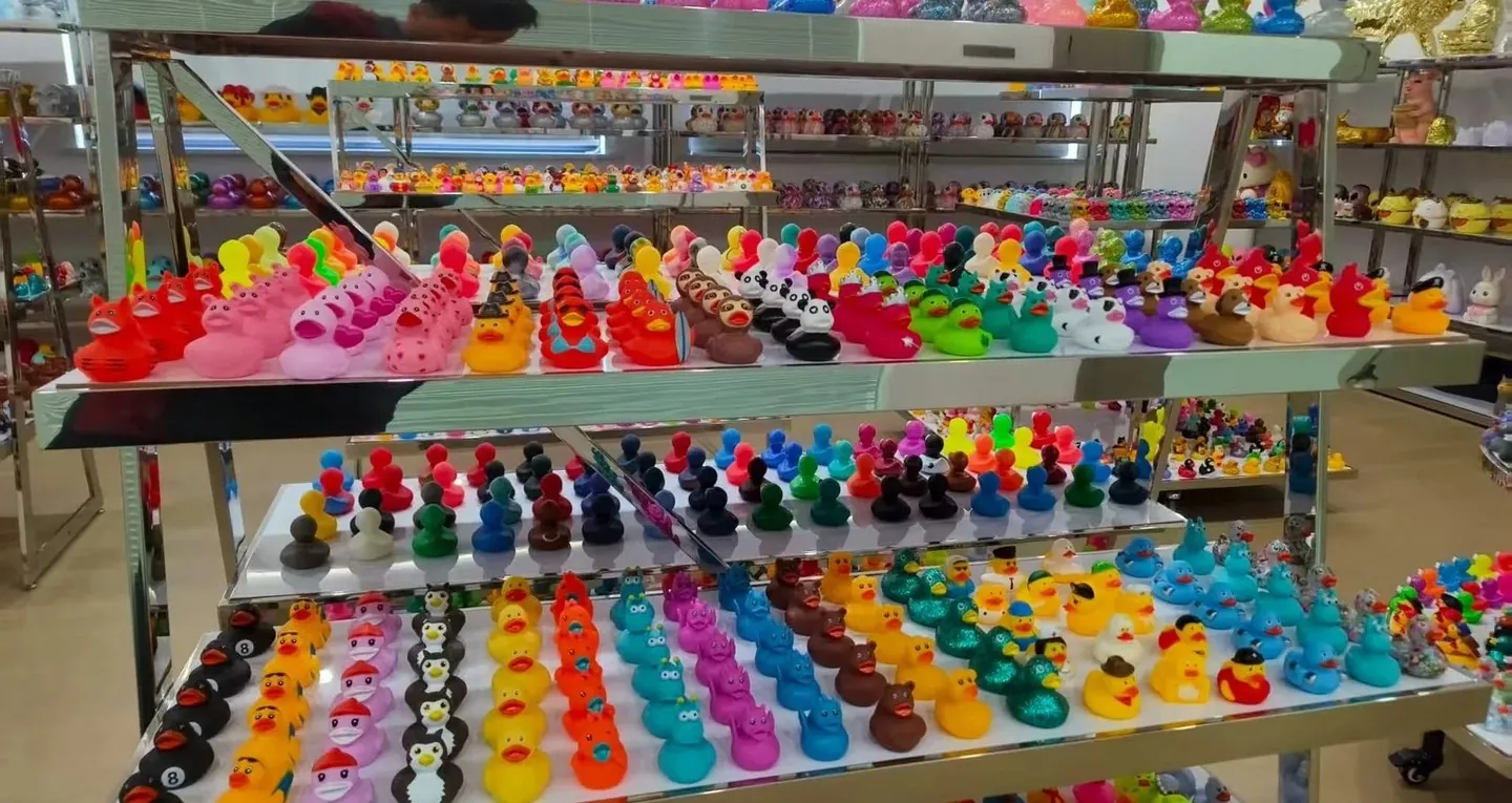
Splitting a mascot duck into two products keeps both a photograph and a squad list affordable. The mascot itself is a new head, a new prop and a new pose; the roster duck is a printed stock body bought in volume. A team that asks one duck to do both usually ends up with a sculpt nobody can afford and a roster duck nobody recognises.
A team character becomes a duck in two different products: a sculpt and a roster duck.
In short: team mascot ducks work when the character is split into a sculpt for the few and a printed stock body for the many. Decide which single feature the character cannot lose, then choose the route that keeps that feature with the least new tooling. Print is the simplest layer, but it cannot reshape a head.
Why a team character is not a duck design yet
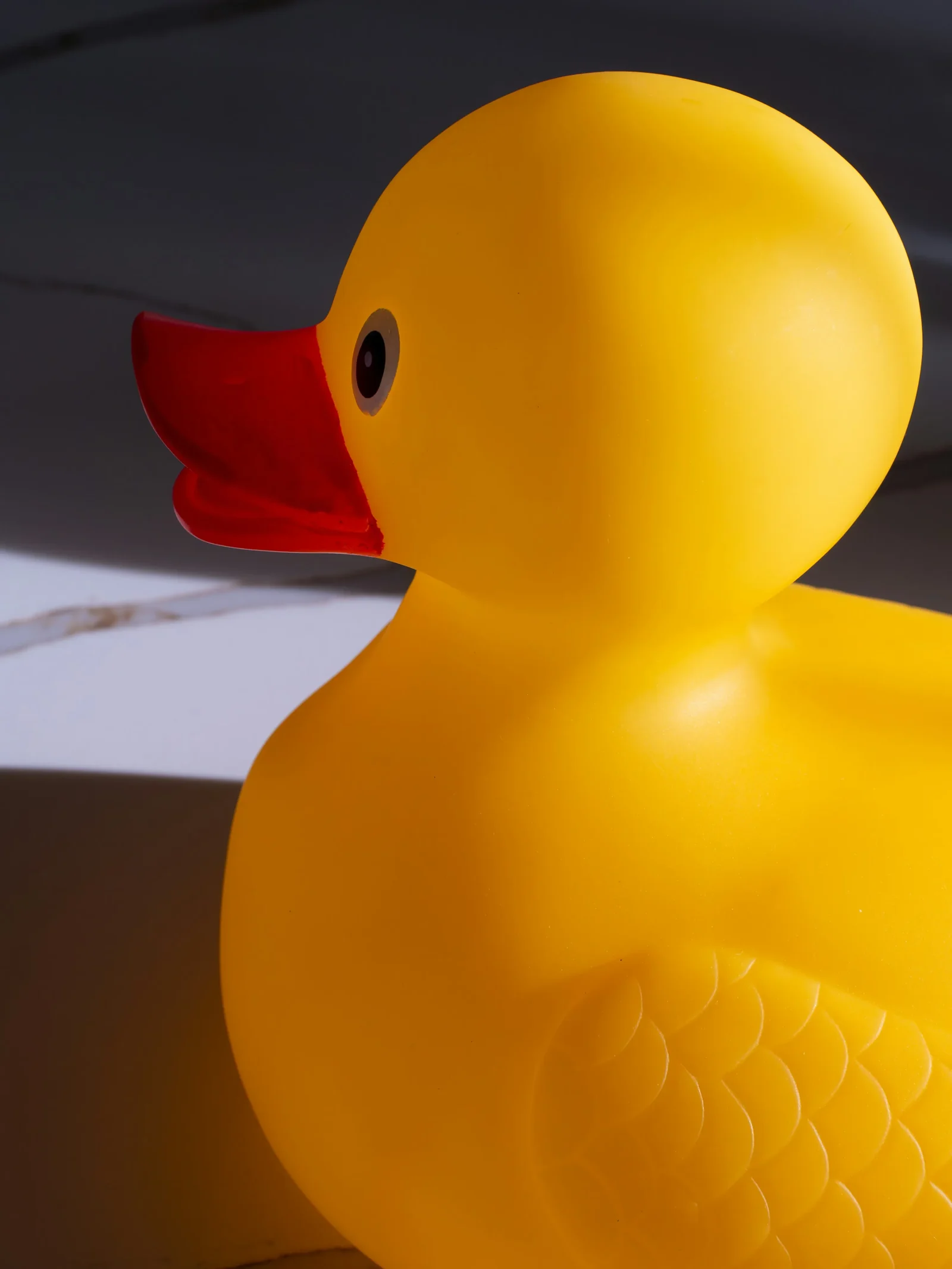
A mascot drawing is flat. A duck is a specific body: a round hull, a fixed beak, wings that sit on the flank, no shoulders and no waist. The drawing can put a cape, a crest and a helmet anywhere. The duck can only put them where the body has a surface that faces the viewer.
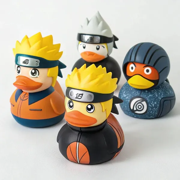
That is why a character does not transfer by tracing it. Three things carry identity in a mascot: the silhouette of the head, the colourway, and one mark. The head is the hardest, because the duck already owns the head. A team whose character is recognised by hair volume, horns or a helmet is asking for a new head, not a new print.
The rest of the body is a chassis. Almost all of the expression comes from what is added to the chassis and how it is coloured, which is why the same duck body can serve a gym, a finish line and an esports stage in three different kits. The design work is deciding what belongs to the chassis and what belongs to the kit. The licensed character note covers the same split from the rights side.
Three routes, and only one of them is a mascot
| Route | What changes | What the character keeps | Where it stops working |
|---|---|---|---|
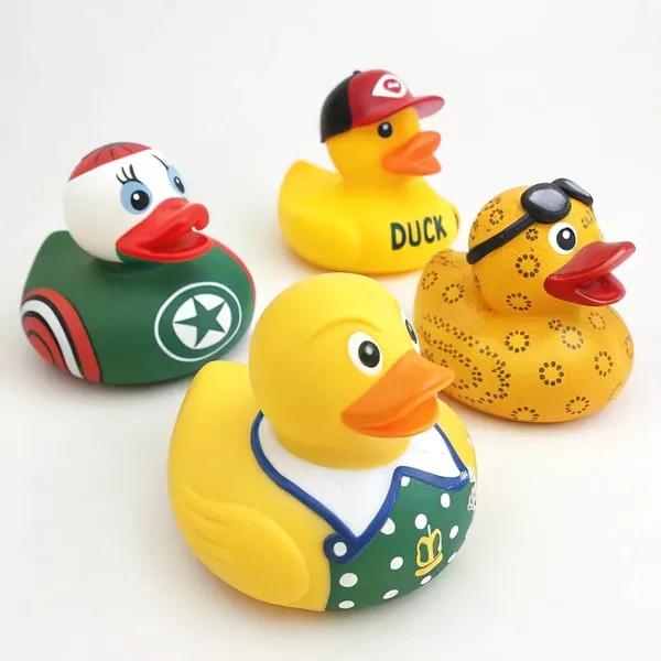
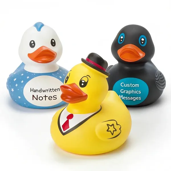
| Printed kit | Artwork only, on a stock body | Colourway, mark, a jersey and a number | Any shape in the head or the prop |
| Two colour body | A second colour shot in the same tool | A colour block on the body itself | Fine detail and any new outline |
| Moulded part | One added piece, assembled after moulding | A prop, a helmet, a crest in relief | A character that lives in its whole pose |
| New sculpt | Model, tool, sample, production | The head, the pose, the silhouette | A character nobody needs in three dimensions |
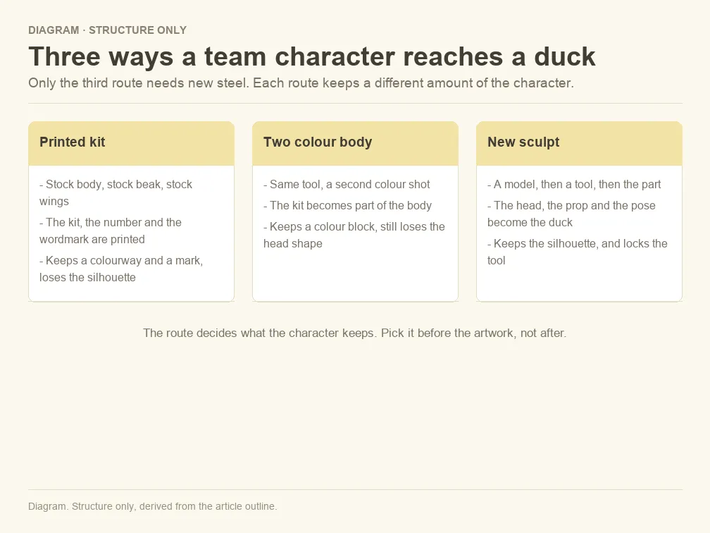
Read down the first column and the split is obvious. Print and the second colour are kit changes. A moulded part is a small structural change. Only the new sculpt changes what the duck is, and only the new sculpt needs new tooling.
Most team programmes start at the top of the table and stop before the bottom, because a mascot only has to exist once. The roster duck is the one that has to exist in thousands, and it is also the one that has to survive a bag, a gym floor and a season of handling.
The one feature the character cannot lose
Before any artwork, I ask for the feature test. Show the character at arm's length, at three metres, and in one colour. If a feature survives all three, it is the feature to protect. If nothing survives the one colour test, the character depends on colour and the body will have to carry a colour block rather than a printed badge.
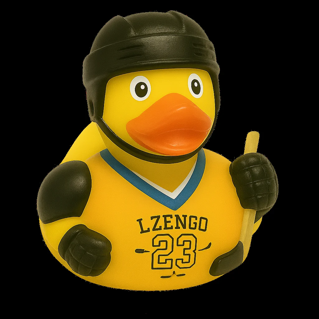
The answer decides the route. Hair volume, horns and a helmet cannot be printed, so they need a sculpt or a moulded part. A flat badge, a number and a wordmark print well and belong on the chest, where the surface is closest to flat. A prop such as an axe or a ball can be a separate piece, which keeps the scarf, the jersey and the number in print, where they can change between seasons.
The useful discipline is to name the feature in one sentence and write it into the artwork brief. A mascot duck that has been through that sentence is easier to approve, because the reviewer is checking one thing rather than judging the whole duck. The logo placement note explains why the placement follows the curvature rather than the drawing.
A new sculpt is the point of no return
The body of a duck is a chassis with a fixed wall and a fixed base, and a new head or a new pose is a change to that chassis. The route is a model, then a tool, then a part. Once the tool exists, the outline is set: colour, print and finish can still change, but the silhouette cannot, and an outline change means cutting the tool again.
That order is why a prototype matters more than a rendering. A printed model shows the proportions in the hand, and the hand is where a mascot is judged. The prototype is also the moment to notice that the beak now sits lower than the drawing, or that the helmet hides the eyes at three metres, which is a simple moment to change a model and an expensive one to change a tool.
Revisions are normal, and they are not the problem. The problem is a revision that arrives after the tool is cut, because it turns a design conversation into a tooling project. The prototype note sets out the difference between the model and the tool sample, and the revision note covers how many rounds a character usually takes.
Print carries the kit, and it stops at the curve
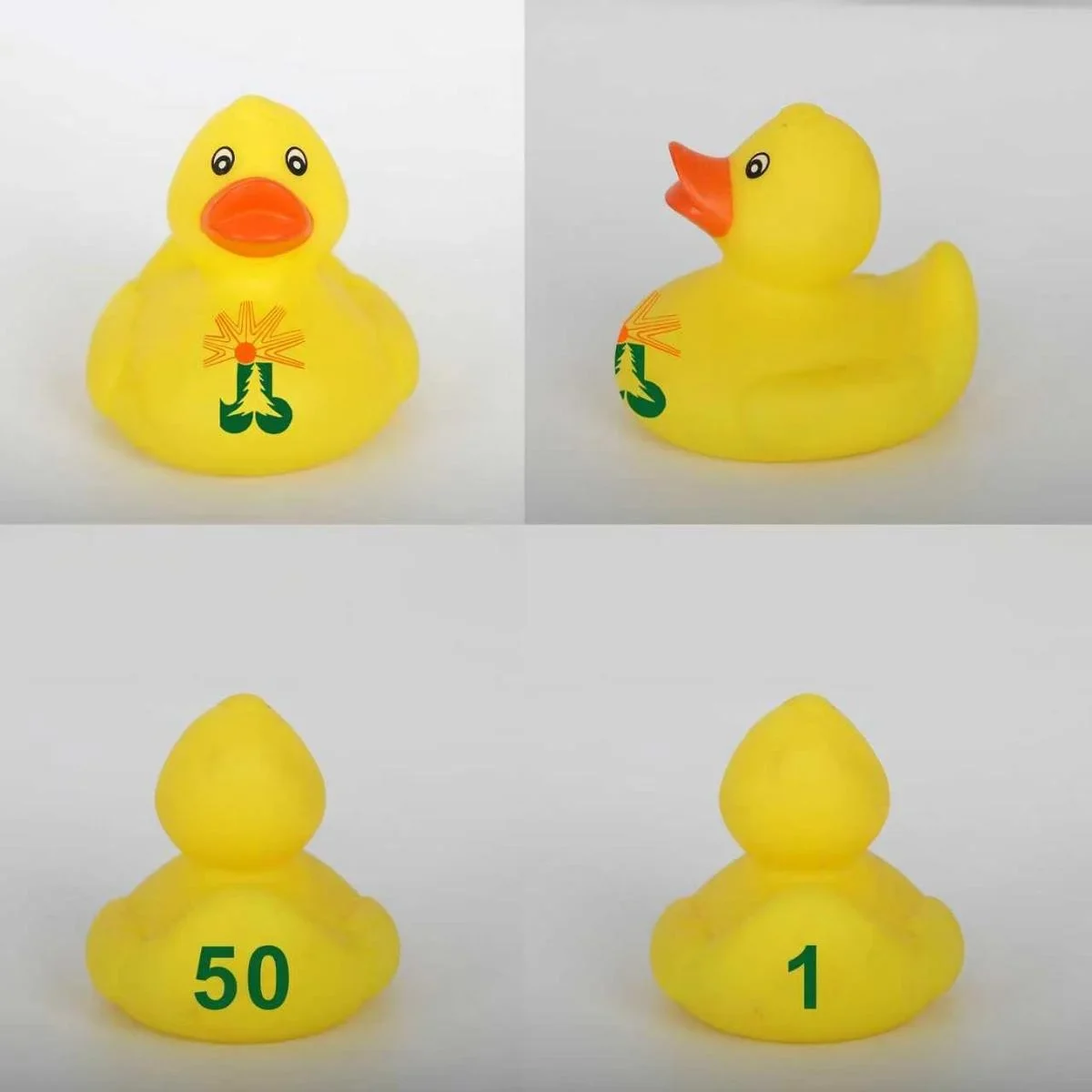
Print is the layer that changes every season. A pad print or a UV print sits on the surface, so it follows the curve of the body rather than lying flat on it. A mark that is one width on the chest will read narrower on the flank, and a long word will bend around the wing.
The chest is the flattest field on the duck, which is why the wordmark and the number live there. The flank works for a small badge and for a colour block, and the top of the head is a poor place for anything with a straight edge. A four view proof, front, side, back and top, is the only proof that shows the whole job before production.
Print is also the layer that has to match the kit across a squad, a gym and a race. A blue that drifts between the jersey on the duck and the jersey on the team sheet is the most common complaint in a first season, and it is a reference problem rather than a print problem. The print method note compares the two processes, and the colour reference note explains the colour standard behind the proof.
A moulded part is a compromise and a safety decision
A helmet, an axe, a shield or a pair of gloves is a second piece, moulded separately and assembled after the body comes out of the tool. It buys a silhouette that print cannot give, and it brings three problems with it.
The first is attachment. A part that is glued or pushed into the body has a join, and the join is the part that fails after handling. The second is proportion: a moulded part adds weight at the head or the hand, and a duck that was balanced for water will sit differently. The third is the one that matters most when the duck reaches a child, because a small detachable piece is exactly what a small parts test is looking for.
That last point belongs in the brief, not in the inspection. A toy for a young age band has to be designed so that a part cannot come loose in ordinary use, and the record that proves it is issued for the product, not for the factory. In the United States the certificate of conformity for a children's product is issued by the importer or the domestic manufacturer (16 CFR Part 1110), which means the team that puts the duck into the market is the party that signs it. The accessories note covers how a part is designed in, and the facial detail note covers the small features that are easy to overlook.
What the team signs, and what the factory signs
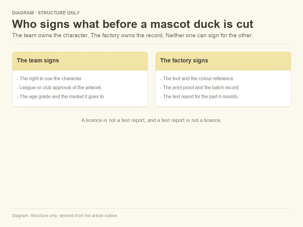
A character is somebody's property. A drawing or a character design is protected by copyright, and making a three dimensional duck from it is the preparation of a derivative work, which is one of the exclusive rights the owner holds (17 U.S.C. 106). A club crest or a league mark adds a second layer, because using a registered mark in commerce in a way that is likely to confuse is a separate exposure (15 U.S.C. 1114).
The factory cannot sign either of those. What the factory signs is the record: the tool, the colour reference, the print proof, the batch and the test report for the part it moulds. A written licence and a test report are two different documents, and a programme that has one and not the other is a programme with a hole in it.
In practice that means the buyer confirms the rights before the artwork is approved, and the factory confirms the technical file before the tool is cut. Asking for both in the same email is fine, but they are answered by different people, and a supplier that says yes to both without asking a question is a supplier worth a second look. The branded duck guide covers the artwork side of the same handover.
The roster duck is a separate product
The roster duck is the volume product, and its count comes from the audience rather than the squad. A team of twenty needs twenty mascots at most, but a season of home games, a gym floor in January or a finisher line in October is a count in the hundreds or thousands, and that count is what a stock body is for.
One body can serve three distances, three team codes or three events, because the difference between them is print and packaging. A race usually needs one duck per finisher rather than one per registrant, a gym usually needs the duck to survive a bag and a locker, and an arena usually needs the mark to read from the back of the stand, which is a size and contrast question rather than a moulding question.
Keeping the character on one body across all of those is what makes a programme look deliberate. It also makes the second season easier, because the reference is already on file. The custom duck note explains the stock body options, and the size note covers how a size change moves the print, the pack and the carton.
Five questions to settle before the sculpt starts
- Which single feature would make the character unrecognisable if it were missing?
- Which route keeps that feature: print, a second colour, a moulded part or a new sculpt?
- Who in the organisation can sign the rights to the character, and in which markets?
- Which duck is the mascot and which one is the roster giveaway, and what is each count?
- What will the factory hold as the reference when the team reorders next season?
Five answers turn a mascot brief into a short document that a toolmaker and a printer can both work from. The questions are simple to answer at the start and expensive to answer after the first sample, which is why they belong in the first conversation rather than the last.
Final Note
My preference is a printed roster duck and a single sculpted mascot, because that pairing keeps the character recognisable and the volume affordable. A team that tries to make every duck a mascot usually pays for a tool it did not need, and a team that prints everything usually ends up with a character that only works on paper.
The test I trust is the one line brief. If the character can be described in one sentence, the mascot can be judged against that sentence, and the roster duck can carry the rest in print. If the sentence keeps changing, the design is not ready, and no amount of tooling will settle it.
Frequently Asked Questions
Can you mould our mascot exactly as drawn?
No, and the honest answer is that a drawing is not a mouldable specification. A duck has a fixed beak, a fixed base and a shell that has to release from a tool, so the sculpt is an interpretation. What can be matched is the feature that carries recognition, and that feature should be named before the model is made.
Does a mascot duck need a toy safety file?
It does when the duck can reach a child, which covers most giveaways. The file follows the age band and the market, and the certificate for a children's product is issued by the party that places it on the market rather than by the factory. A mascot sold only as a display piece still needs its status written down.
Can we order the mascot duck and the roster ducks together?
Yes, and that is the usual pattern. The mascot is a small run from one tool and the roster duck is a larger run from a stock tool, so the two sit on the same purchase document without competing for capacity. Keeping them separate on the document makes it easier to see which line carries the tool.
What if the character belongs to a league rather than to our club?
Then the licence has to come from the league, and the club can only grant what it actually holds. The practical check is to ask who owns the drawing, who owns the mark and who can license the combination. A club that answers all three in writing is a club that has done this before.
Key takeaways
- Why a team character is not a duck design yet: a duck body has its own outline, so a flat drawing is a brief rather than a specification.
- Three routes, and only one of them is a mascot: print and a second colour change the kit, only a new sculpt changes the character.
- The one feature the character cannot lose: the arm's length, three metre and one colour tests decide the route.
- A new sculpt is the point of no return: after the tool is cut the silhouette is fixed and a model is the right place to change it.
- What the team signs, and what the factory signs: a licence and a test report are different documents, held by different parties.